The RJMetrics Dashboard is a powerful analytics platform that allows users to dissect their data in countless ways from dozens of perspectives. This post focuses on one of our favorite ways to slice data: cohort analysis.
Cohort analysis has been used by statisticians for decades (most prominently in the fields of medicine and finance). However, recent advancements in data collection and processing power have made cohort analysis a viable technique for online businesses to study customer loyalty trends, predict future revenue, and monitor churn.
Major tech players including investor Josh Kopelman and entrepreneur Eric Ries have heralded cohort analysis as a preferred analysis technique. Cohort analysis is heavily used by venture investors and consulting shops to quantify the value of a company’s existing customer base.
In this article, we explain what a cohort analysis is, why you should use it, and how to conduct a cohort analysis on your company’s data using RJMetrics‘ newly revamped cohort analysis builder.
Performing Cohort Analysis Using RJMetrics
The video above shows how easy it is to conduct a cohort analysis in RJMetrics. Read on for more information about cohort analysis, and why using RJMetrics to conduct cohort analysis can help your company save money and drive growth.
What is Cohort Analysis?
Sometimes called static pool analysis, cohort analysis can be broadly defined as the view of how specific, unchanging groups of customers behave over the same periods in their respective customer life-cycles.
The most popular cohort analysis (and the one we will demonstrate here today) involves segmenting customer groups based on a “join date.” This might be the date a given customer signed up for your website or the date they made their first purchase. As a general rule, it’s the timestamp of their first relevant interaction with your business. The year, quarter, month, or week of that date then becomes the user’s “cohort,” meaning each cohort is the set of users who joined in that same time period.
For example, if you are an e-commerce business and you choose to group cohorts by month, the “January 2009” cohort contains every customer who made their first purchase in January 2009. By design, no single customer can exist in more than one cohort, and a customer’s cohort will never change.
In a cohort analysis, we compare how members of different cohorts behave over time. This is typically visualized using a multi-series line chart that displays each cohort as its own line and shows “time since join date” on the x-axis. Note that the time periods associated with each cohort’s data are different. For example, the “Month 3” data point for the January 2009 cohort is their sales data from March 2009, whereas the same data point for the July 2007 cohort is their sales data from September 2007. Naturally, we have more data points for older cohorts, so their lines will be longer than newer cohorts (or we can cut their lines off after a specific amount of time).
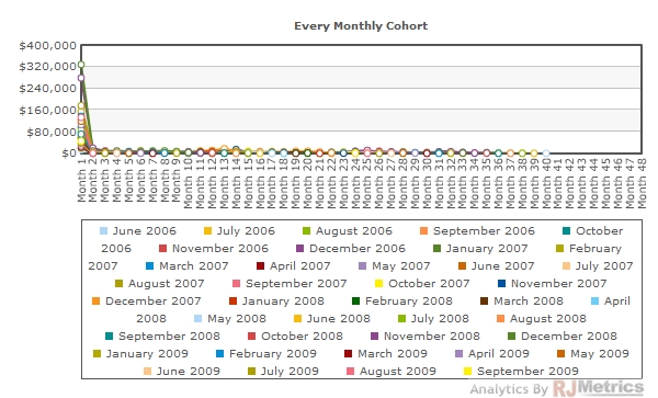
Below, we show a graph of the raw data from a cohort analysis of the fictitious e-commerce company Vandelay Industries:
What a mess! It’s hard to extract any value out of something this jumbled, so we’ll have to whittle down the cohort data set to get what we’re looking for. First, however, we need to decide what we’re looking for in the first place. One of the best uses of cohort analysis is to monitor whether customers you have added recently are as “valuable” as those customers you added in the past.
Customer “value” is directly tied to the amount of revenue a customer generates over their lifetime (or their engagement over time in ad-driven businesses), which is directly tied to repeat purchase behavior. If we can look at cohorts from the past and compare their repeat purchase behavior in some initial time period against newer cohorts, we’ll have a pretty clear picture of how the customer set is evolving in terms of expected lifetime value. This information plays a valuable role in many business decisions, including customer acquisition cost thresholds.
Let’s take a few steps to extract this information from the data above.
Cohort Size
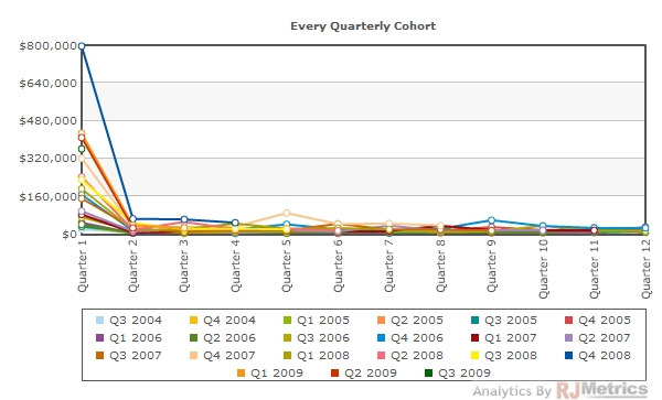
We want to be sure that each cohort contains enough customers to constitute a representative sample. Depending on your repeat purchase rates, the magic number can fluctuate considerably, but as a general rule each cohort should contain at least several dozen customers. To be safe with our data set, we’ll use quarterly cohorts instead of monthly cohorts. (Increasing or decreasing the size of the cohort’s time period obviously increases or decreases the number of customers in each cohort.) Here’s the quarterly picture:
Now we’re getting somewhere. Let’s proceed by further reducing the number of cohorts.
Number of Cohorts
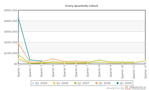
Since we’re interested in how cohorts behave over the lifetime of this business, it’s not really necessary that we show every single cohort. To avoid clutter, we’re best served by only showing one cohort per year (evenly spaced out). Let’s take a look at only the Q1 cohort from each year since 2005:
This is much better– now we’re looking at a manageable number of cohorts. But, there’s much more we can do.
Relative (Percentage) Comparisons
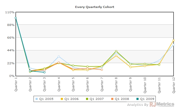
From 2005 to 2009, Vandelay Industries grew considerably. If you look at the “Quarter 1? sales of Q1 2005 as compared to Q1 2009, you’ll notice that the latter generated over 10x as much revenue. Comparing repeat purchase behavior between these two groups on an absolute dollars basis could be very misleading, since the 2009 cohort is clearly much larger. What makes more sense is viewing the data on a percentage basis. Specifically, the quarterly revenue generated by each cohort as a percentage of its initial purchase amount:
This provides a much clearer, apples-to-apples comparison. You may notice in the chart above that the “Quarter 1? data point for each cohort is 100%. This happens by design, since each cohort obviously spends 100% of their first quarter’s sales in their first quarter.
Hide First Data Point
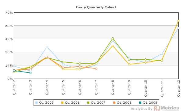
To free up some flexibility on the Y-axis, we can hide the first data point and only look at the repeat behavior in subsequent quarters. Since that first data point is 100% for every cohort, we’re not losing any information:
We’ve come a long way from our first chart and now we’re in a position to draw some conclusions from the data!
Conclusions
The chart above (and its underlying data) can lead us to some very telling conclusions about our customer set. Here are a few offhand observations:
- Generally, new customer cohorts follow a predictably-shaped pattern of repeat purchasing activity, and the chart above provides us with a high degree of confidence about the expected revenue from a given cohort over the first 12 quarters of its lifetime. We can use this data to inform inputs to financial models that predict financial performance.
- The spikes at quarters 4, 8, and 12 suggest that customers demonstrate strong repeat purchase behavior in Q4 (the holiday season), even if they did not make their first purchases during a holiday season. (Note that Quarters 4, 8, and 12 are always Q4s, since each of these cohorts is a Q1.)
- Repeat purchase probability actually appears to increase over time. This is highly unusual for any business, as in most cases customer loyalty gradually declines over time. This an extremely interesting trend that places a premium value on the existing customer base.
- There is no visible decline in repeat purchase likelihood in newer cohorts as opposed to older ones. Newer cohorts are clearly not any “weaker” than their predecessors when it comes to repeat purchase behavior. This answers our original question: Vandelay’s aggressive growth has not come with the cost of a “weaker” new customer base.
Each of these can be more directly quantified and informed using the underlying data from the above chart. It would also be worth looking at different cohorts to rule out any exposure to seasonality that came from our cohort selection.
Performing Cohort Analysis by Hand
Performing a cohort analysis by hand requires, at the very least, three things:
Strong SQL Knowledge
To perform a cohort analysis (and keep the data fresh), someone in your organization will need to routinely run complex queries on your database to extract data grouped by customer cohorts. However, customer cohorts are not stored by default in any database, and customer join dates (or first purchase dates) are rarely stored in the same table as sales or interaction data. This means the queries will involve complex joins and/or the creation of temporary tables.
Once a join date can be associated with each sale, the cohort itself will need to be extracted and grouped. Most database platforms will provide functions like YEAR() and MONTH() to extract the year or month of a given join date, but calculating a quarter or week is a significantly more complex proposition. In almost all cases, these data points will be calculated on-the-fly as part of your query, which means your database will not be able to use indexes to speed up the grouping process. Even with a small company’s data set, this could mean queries that bring your system to a crawl for minutes at a time. Obviously, cohort analysis should never be run on your production database.
Strong Excel Knowledge
If your SQL process went well, the raw cohort data will come out of your database as a tall, skinny table with three columns: cohort, purchase period, and value. This data will need to be migrated into Excel and further manipulated before any value can be extracted. Pivot tables are the weapon of choice for this data, and they allow you to easily view a table of how much revenue was generated by each cohort in each period.
However, recall that we don’t care about how much was bought by each cohort in each calendar period– we care about how much was bought by each cohort in each period relative to their first purchase period (i.e. Month 1, Month 2 rather than January, February). Doing this either requires manipulation of the data before it goes into the pivot table (to calculate a “relative period” field) or actually shifting the data appropriately by hand after it comes out of the pivot table.
When you’re done with all that, don’t forget to augment the data used for charting so it shows a ”percentage of first purchase” rather than absolute values.
Time (aka Money)
Conducting a cohort analysis requires that rare breed of super-employee who is both competent in computer science and financial analysis. It is an extremely time consuming process on both fronts, and unfortunately doesn’t get much faster when you do it on a regular basis. Generating and updating a cohort analysis each month can cost the equivalent of thousands of dollars of your team’s time. Bringing in an outside consulting firm to conduct similar analyses could easily cost tens or hundreds of thousands of dollars.
Performing Cohort Analysis Using RJMetrics
As you saw in the video at the beginning of this post, anyone in your organization can do a cohort analysis in minutes using RJMetrics. This can save thousands in labor and provide new insights to help drive business growth and value.
The options for building a cohort analysis in RJMetrics include:
- Grouping cohorts by weeks, months, quarters, or years
- Showing any desired cohorts (either by explicit selection, specific ranges, or ranges that automatically shift over time)
- Showing only the desired number of data points
- Consolidating as many data periods as desired into each data point on the x-axis (e.g. show months 1-3, 4-6, etc.)
- Showing by percentage of first data point
- Hiding the first data point
- Further restricting cohorts by geography, behaviors, or other attributes
- Not straining your servers in any way
- Computing a result in seconds
- Exporting all underlying data Excel or CSV with one click
Want to learn more? Try out the free demo.

